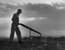
My Planet Whizbang wheel hoe is an improved modern incarnation of the old Planet Jr. wheel hoe produced by Samuel Leeds Allen back in the late 1800s and early 1900s. How ol' S.L. came up with the name, Planet Jr. is a complete mystery to me.
Equally mysterious is the Planet Jr. logo, as shown in this next illustration:

What does a logo of the planet Saturn have to do with agricultural implements? Answer: Nothing at all. Like I said, it's a mystery.
But Planet Jr. was once a very big company with a worldwide market. That unusual (but memorable) name and logo was as well known and recognized as John Deere is today.
When I considered the possibility of a unique logo for my new Planet Whizbang wheel hoe, I wanted it to have some out-of-this world, or planetary theme in deference to the old Planet Jr. logo. But I also wanted the Planet Whizbang trademark to have a decidedly down-to-earth aspect. In other words, I wanted a totally oxymoronic logo.
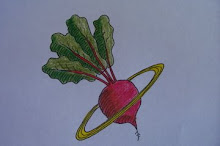
This was quite a conumdrum. But in a flash of pure inspiration, I came up with the idea of a vegetable surrounded by golden Saturnal rings.

What, I ask you, is more down to earth than a beet? perhaps a potato but, as much as I respect and appreciate potatoes (after all, my grandfather was a potato farmer), they do not compare to the beet for visual appeal.
I strongly considered a carrot because, truth be known, I’m especially fond of carrots. But your average carrot is simply not globular enough for the job.
Turnips came to mind. I love the two-tone color of the root. But turnips are a little too obscure.
Rutabagas (known by the old timers as “swedes”) are more obscure than turnips but they are probably the one root crop that looks most like a planet than any other. Nevertheless, rutabagas are not nearly as recognizable (or respected) as the beet.
Radishes? Well, radishes are certainly earthy. But it’s hard for me to take radishes seriously.
And so it was that I chose a lovely beet with its delightful red-veined green foliage and, of course, the Saturnal rings.
When I first showed my wife the new Planet Whizbang logo, she was speechless. I watched her face intently for some clue to her thoughts. I sensed a hint of a smile as she finally mumbled: “It’s a nice looking beet.” I took that as affirmation of the “rightness” of the design.
Later, my wife made some comment about “that beet with a halo.” I immediately corrected her: “That’s not a beet with a halo. Those are Golden Saturnal Rings!”
I wonder what S.L. Allen’s wife thought of the name “Planet Jr.” and his planet Saturn logo?
Whatever the case, let me make it clear now and for future generations that there is no symbolism or hidden meanings in the Planet Whizbang logo. It is simply a whimsical variation of a unique old trademark. In the end, I can tell you that I settled on this new logo for the same reason I like old-time banjo music.....it makes me smile.
In time, maybe I’ll come out with a whole line of products sporting the Planet Whizbang logo—hats, coffee mugs, shirts, beach towels, boxer shorts..... Why not?
============================
Note: The “Planet Whizbang” name is a trademark established on 2 March 2009. All rights to this name are fully owned by Herrick Kimball of Moravia, NY. The Planet Whizbang logo of a green-leafed red beet encircled by golden Saturnal rings is a trademark established on 28 May 2009. All rights to this image are the property of Herrick Kimball of Moravia, N.Y.